Analytics are only useful when people trust what they are seeing.
That is especially true for links. If you share a short URL with customers, readers, teammates, or followers, you want a clear answer to a few simple questions: how many people clicked, what devices they used, where they came from, and whether your audience is growing in the way you expected.
This update is about making those answers more dependable.
Plung analytics now does a better job of recording real visits, classifying device and browser data more accurately, resolving countries more reliably, and keeping analytics views read-only so the act of checking performance does not distort performance.
In short: your link analytics should now feel far more trustworthy.
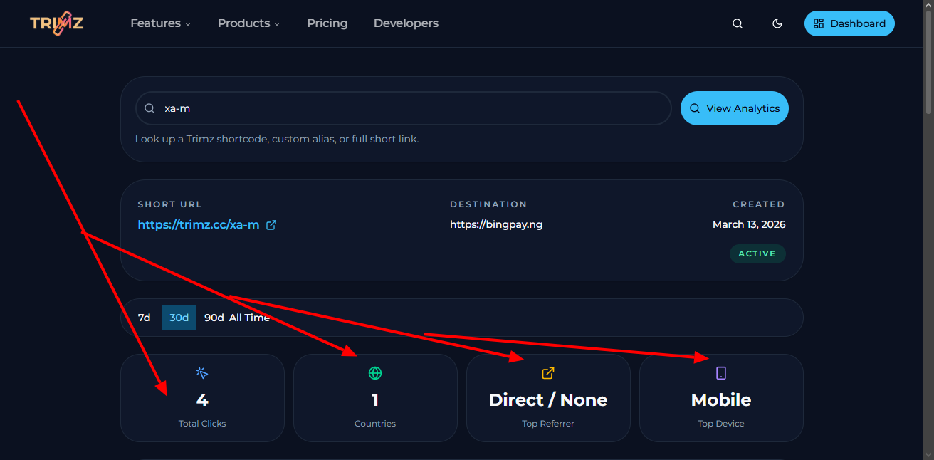
Public analytics for a real Plung link, including total clicks, countries, devices, browsers, and operating systems.
What changed
The biggest improvement is simple:
a real visit should count once, and only once.
That sounds basic, but it is the foundation for everything else. If click counts are inflated, every chart built on top of them becomes less meaningful. If device or location data is incomplete, the dashboard becomes harder to act on. And if simply opening analytics changes the numbers underneath it, confidence drops immediately.
With this release, Plung analytics is much better aligned with what users actually expect from a reporting product:
- click totals are cleaner
- country reporting is more dependable
- browser and operating system breakdowns are more useful
- mobile and desktop traffic are classified more accurately
- analytics pages no longer create clicks just because they were opened
That turns analytics from a rough activity log into something closer to a decision tool.
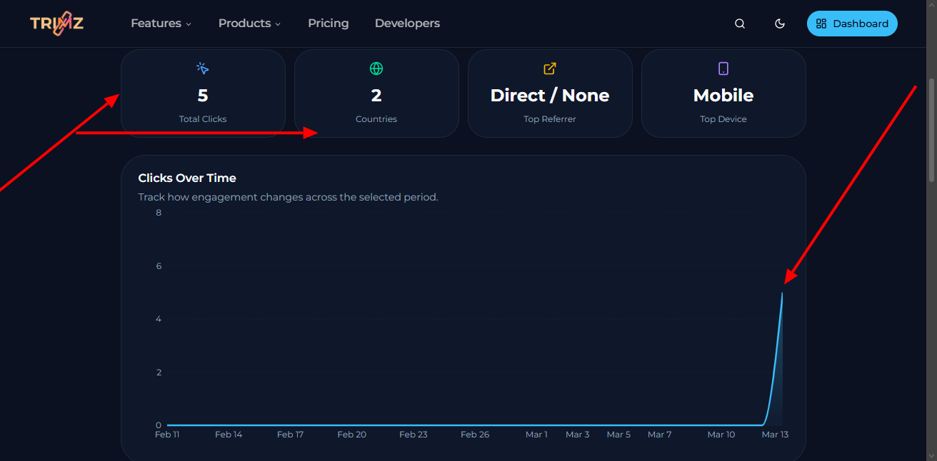
A single real visit increases analytics once, without duplicate events or inflated counts.
Why this matters for link owners
Most people do not need a dashboard for its own sake. They need a dashboard because they are trying to understand whether a link is working.
Maybe you are sharing a campaign link and want to know if mobile traffic is dominating. Maybe you are sending a product link to different regions and want to see which countries are responding. Maybe you are watching how a link performs across browsers, or trying to understand whether traffic is mostly direct or coming from another source.
Those questions only become actionable when the reporting layer is clean enough to trust.
That is why this release matters even if you never think about analytics systems directly. Better counting and better visitor resolution lead to better judgment. And better judgment is what makes analytics valuable.
Better device, browser, OS, and country reporting
One of the clearest improvements in this release is in the quality of visitor details.
When analytics systems lose clean request context, dashboards drift toward vague or incomplete values. Devices become harder to classify. Browsers and operating systems appear as unknown or inconsistent. Country reporting becomes less believable. Over time, even a visually polished analytics page can start to feel uncertain.
Plung now does a better job of preserving and interpreting the signals needed to describe real visits accurately. The result is cleaner device reporting, stronger browser and OS visibility, and country data that is more useful when you are trying to understand where attention is coming from.
For everyday users, that means the analytics page is easier to read and easier to trust.
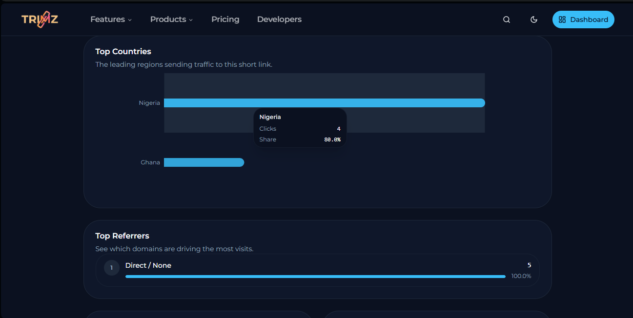
A real phone visit resolved with the correct mobile device type, browser, operating system, and country.
Cross-device analytics now tell a clearer story
A strong analytics product should not just count traffic. It should reveal a believable pattern of behavior.
If one person clicks a link from a phone and another clicks from a laptop, the analytics should reflect that difference. If those visitors are in different countries, that should show up too. The charts should move in ways that feel consistent with what actually happened, not in ways that feel inflated, noisy, or disconnected from reality.
That is one of the biggest gains from this release. Distinct visits now produce a much clearer audience picture across device type, browser, operating system, and geography.
That makes the analytics page more useful not just for reporting, but for understanding.
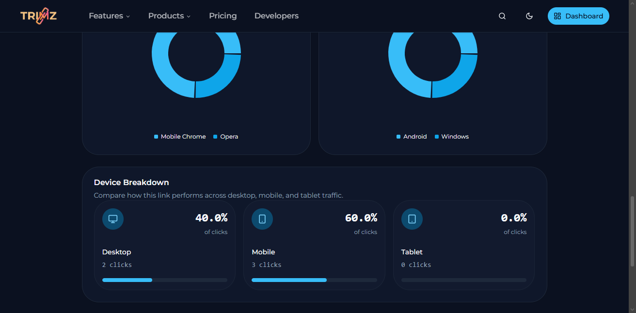
A second real visitor changes the device and country mix in ways that reflect actual audience behavior.
Viewing analytics should never create analytics
This is one of the most important principles behind the update:
opening analytics should not create analytics.
A reporting page should observe performance, not affect it. If the simple act of checking a link's performance can add more clicks to the record, the product stops being a trustworthy source of truth.
Plung now treats analytics views as read-only. You can open a link's analytics page, refresh it, and review the performance without worrying that the dashboard itself is changing the numbers it displays.
That is a subtle improvement in behavior, but a major improvement in trust.
A stronger foundation for every public link
This release is not about adding more chart types or making the page look busier. It is about improving the quality of the analytics that sit underneath the visuals.
That means more confidence when you look at total clicks. More confidence when you compare mobile and desktop traffic. More confidence when you check countries, browsers, or operating systems. And more confidence that the analytics page is reflecting real audience behavior instead of accidental noise.
For Plung, that matters because link analytics should feel like part of the product, not an afterthought attached to it.
If you use Plung to understand how your links perform, the platform should help you answer that question clearly. This update moves us closer to that standard.
Written by
Plung Engineering